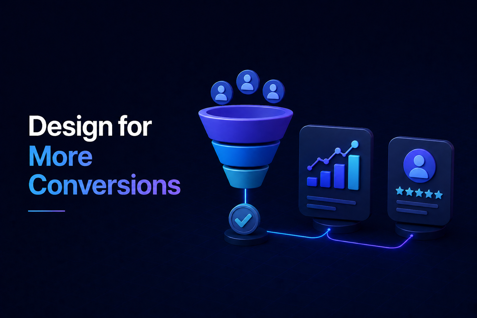
A great landing page isn’t just about looking good; it’s a carefully constructed digital tool designed to achieve a specific goal: converting visitors into leads or customers. If your current pages aren’t delivering the results you expect, a fresh look at your landing page design could significantly boost your conversion rate. Let’s dive into some actionable tips to make your landing pages work harder for you.
Crafting an Irresistible Headline and Value Proposition
Your headline is the first thing visitors see, and it needs to grab their attention immediately. It should clearly communicate the core benefit or solution you offer. Don’t make them guess what your page is about.
Beyond the headline, your value proposition explains why your offer is unique and worth pursuing. It should be concise, compelling, and answer the question: “What’s in it for me?”
- Be Clear, Not Clever: Ensure your headline directly states the primary benefit.
- Focus on the User: Highlight how your product or service solves their problem or improves their life.
Streamlining Your Layout for Optimal Flow
A cluttered landing page can overwhelm visitors and distract them from your main objective. A clean, intuitive layout guides the user’s eye naturally towards your call to action.
Embrace White Space
Ample white space around elements makes your content easier to read and helps key components stand out. It creates a sense of sophistication and reduces visual noise.
Guide the Eye
Use visual hierarchy to emphasize important information. Larger fonts, contrasting colors, and strategic placement can draw attention to your headline, subheadings, and especially your CTA button. Consider using the “F-pattern” or “Z-pattern” for content layout, reflecting natural reading habits.
The Art of a Compelling Call to Action (CTA)
Your CTA is the heart of your landing page; it’s the specific action you want your visitor to take. Its design and wording are crucial for improving your conversion rate.
- Make it Stand Out: Use a contrasting color, sufficient size, and clear button styling so it’s impossible to miss.
- Use Action-Oriented Language: Instead of generic “Submit,” try phrases like “Get My Free Ebook,” “Start Your Free Trial,” or “Claim Your Discount.”
- Placement is Key: Position your primary CTA above the fold, but also consider repeating it further down for longer pages.
Building Trust with Social Proof and Credibility
In today’s digital landscape, trust is paramount. Visitors are more likely to convert if they see evidence that others have benefited from your offer.
- Testimonials and Reviews: Feature genuine quotes from satisfied customers, ideally with a name, photo, and company.
- Trust Badges & Logos: Display logos of well-known companies you’ve worked with, security seals (e.g., SSL certificates), or industry awards.
- Numbers Speak Volumes: Share statistics like “20,000+ satisfied customers” or “Increased conversions by 30%.”
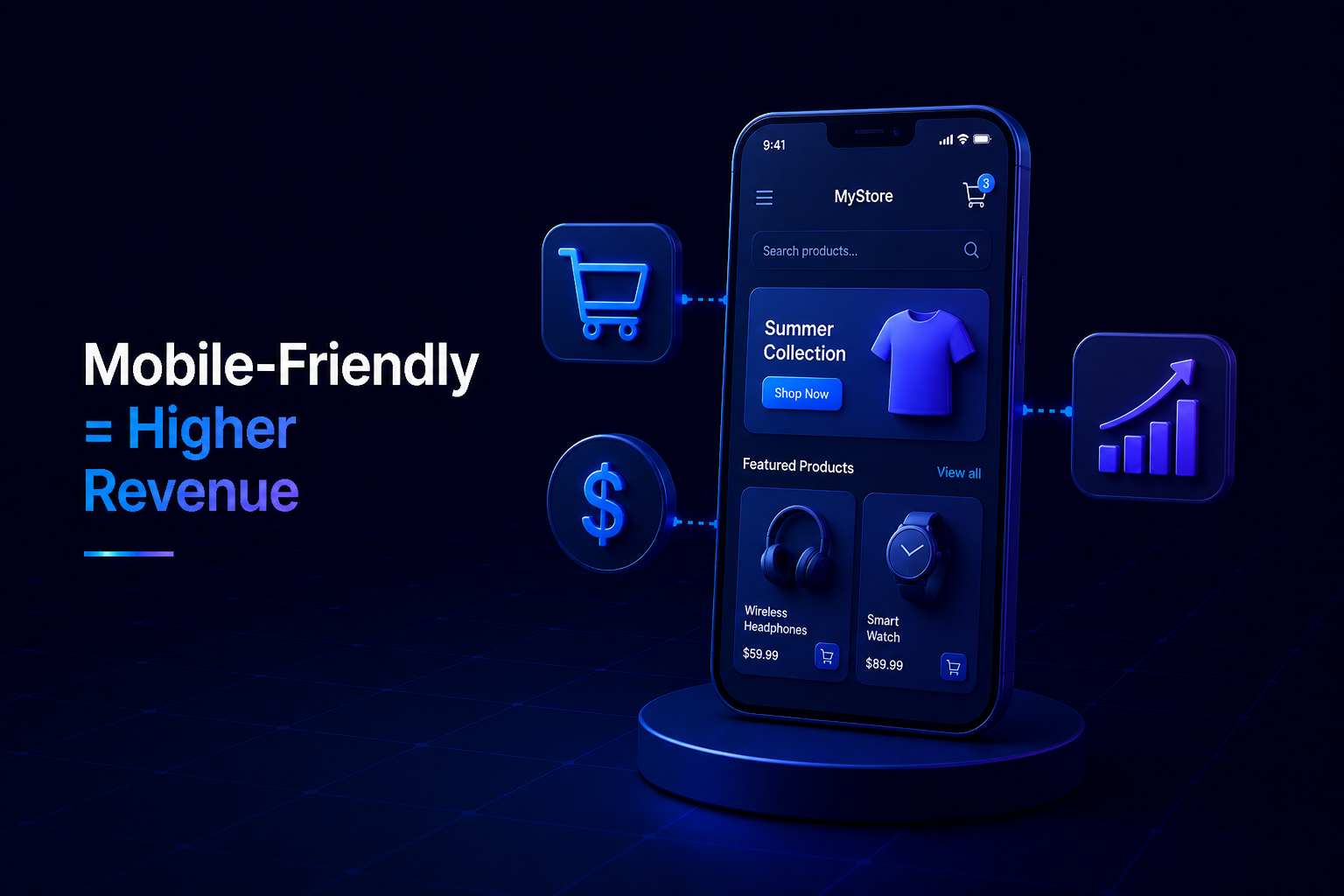
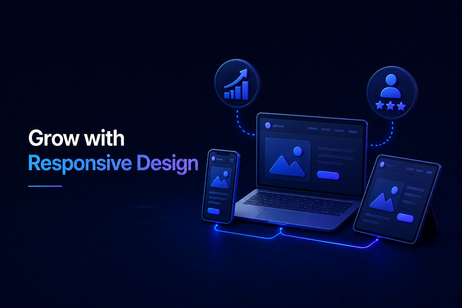
Don’t Forget Mobile & Speed
A significant portion of web traffic now comes from mobile devices. Your landing page design must be fully responsive, adapting seamlessly to any screen size.
Beyond mobile-friendliness, page load speed is critical. Slow pages frustrate users and negatively impact your conversion rate. Optimize images, minimize code, and leverage browser caching to ensure your page loads quickly across all devices.
Conclusion: Test, Learn, Optimize
The journey to a high-converting landing page is ongoing. Even with the best initial design, continuous testing is essential. A/B test different headlines, CTA button colors, image choices, and even entire layouts. By analyzing the data and iterating on your designs, you’ll steadily refine your pages and achieve higher conversion rates, turning more visitors into valuable leads and customers.


No Comments