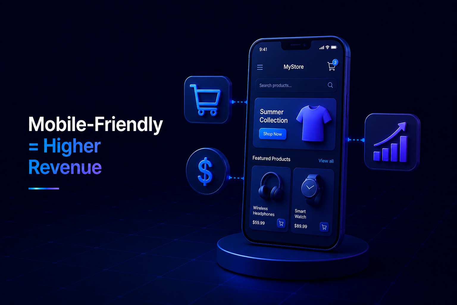
In today’s fast-paced digital world, the majority of online browsing and purchasing happens on mobile devices. For any eCommerce business, having a top-notch mobile ecommerce design isn’t just an advantage; it’s a fundamental requirement for significantly boosting your online store revenue and ensuring sustainable growth.
The Mobile-First Imperative for Online Businesses
Gone are the days when desktop was the primary way customers interacted with online stores. Mobile devices now dominate, serving as the first point of contact for countless shoppers. If your website isn’t optimized for smaller screens, you’re not just providing a poor experience; you’re actively turning away potential customers and leaving valuable online store revenue on the table.
User Experience (UX) Directly Impacts Conversions
A superior mobile ecommerce design translates directly into a smoother, more intuitive user experience. When customers enjoy their time on your site, they are far more likely to explore products, add items to their cart, and complete a purchase. Frustration, slow loading, or difficult navigation, conversely, lead to high bounce rates and abandoned carts.
Easy Navigation is Non-Negotiable
Cluttered menus, tiny text, and unresponsive buttons are mobile shoppers’ biggest pet peeves. A well-executed mobile design features clear, concise navigation, large clickable elements, and intuitive search functionality, guiding users effortlessly through their shopping journey.
Speed Keeps Shoppers Engaged
Mobile users expect instant gratification. Websites that load slowly on smartphones will quickly lose potential customers. Optimizing images, leveraging efficient coding, and using responsive design principles ensure your mobile site is lightning-fast, keeping visitors engaged and reducing the likelihood of them looking elsewhere.
Streamlined Checkout Boosts Sales
The checkout process is where many sales are won or lost. A complex, multi-step checkout form on a small screen is a major barrier. A simplified, secure, and mobile-optimized checkout – perhaps with guest checkout options or digital wallet integration – dramatically reduces cart abandonment and directly contributes to increased online store revenue.
Enhanced SEO and Greater Visibility
Search engines, particularly Google, prioritize mobile-friendliness as a significant ranking factor. A responsive and well-designed mobile site improves your search engine optimization (SEO), making it easier for potential customers to discover your products and services. Higher visibility in search results means more organic traffic, which is a key driver for long-term online store revenue growth.
Building Trust and Customer Loyalty
A professional, seamless mobile shopping experience builds credibility and trust with your audience. When customers have a positive, frustration-free interaction with your brand on their mobile device, they are more likely to make a purchase, return for future transactions, and recommend your store to others. This fosters invaluable customer loyalty and sustainable online store revenue.
Conclusion
Investing in a robust and thoughtful mobile ecommerce design is no longer just a trend; it’s a strategic necessity for any online business aiming to maximize its online store revenue. By prioritizing user experience, optimizing for speed, ensuring easy navigation, and streamlining the checkout process on mobile, you create a powerful, customer-centric shopping environment that drives conversions, builds loyalty, and secures your place in the competitive digital marketplace.


No Comments