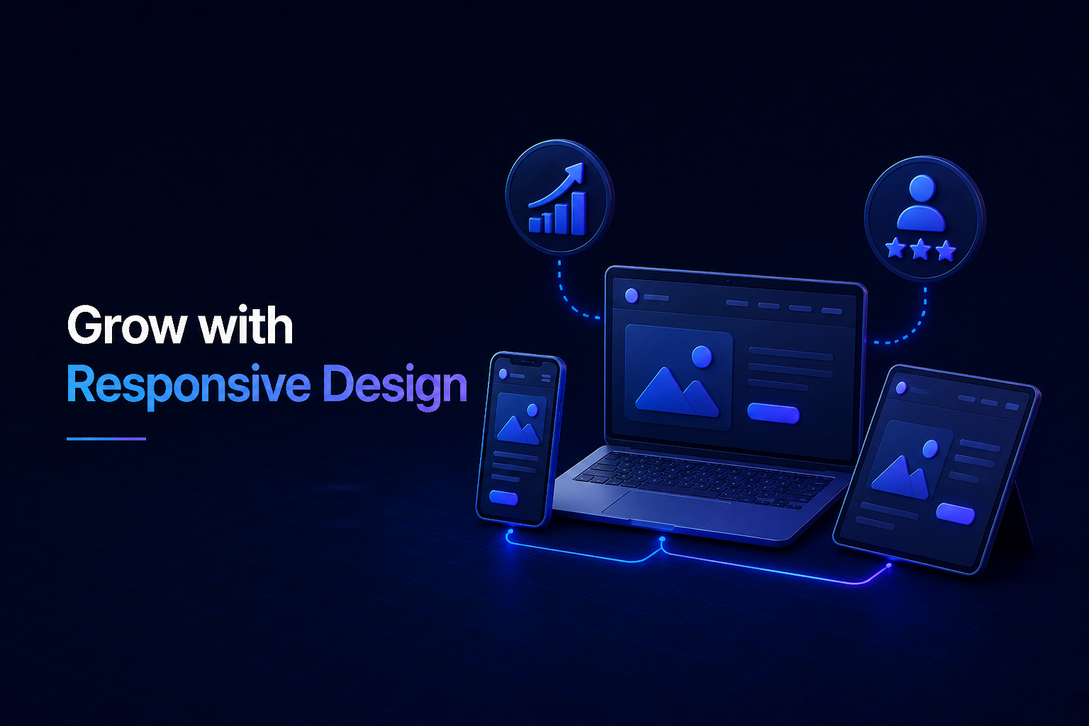
In today’s fast-paced digital world, your online presence is often the first impression potential customers have of your business. To truly succeed, your business website needs to deliver a seamless experience across every device imaginable. This is precisely where responsive web design comes into play, acting as a crucial growth engine for modern enterprises.
Elevating User Experience Across All Devices
Think about how often you browse the internet on your phone, tablet, or even a smart TV. A non-responsive site can be frustrating – tiny text, clunky navigation, and endless zooming. Responsive web design ensures that your site automatically adjusts its layout, images, and content to fit any screen size, providing an optimal viewing experience for every visitor.
Seamless Navigation, Happy Customers
- Your customers can effortlessly browse products, read content, and make inquiries, regardless of the device they’re using.
- This consistent and positive user experience builds trust and keeps visitors engaged longer.
- A frustration-free experience means they are more likely to return and engage with your brand.
Boosting Your Search Engine Rankings
Google has been very clear: mobile-friendliness is a significant ranking factor. Sites that aren’t optimized for mobile devices can suffer in search results, making it harder for potential customers to find your business. Implementing responsive web design directly addresses this crucial SEO element.
Google Loves Mobile-Friendly Websites
- A single, responsive site URL makes it easier for search engines to crawl and index your content.
- Improved mobile usability contributes positively to your overall SEO score and domain authority.
- Better search visibility means more organic traffic for your business website, expanding your reach.
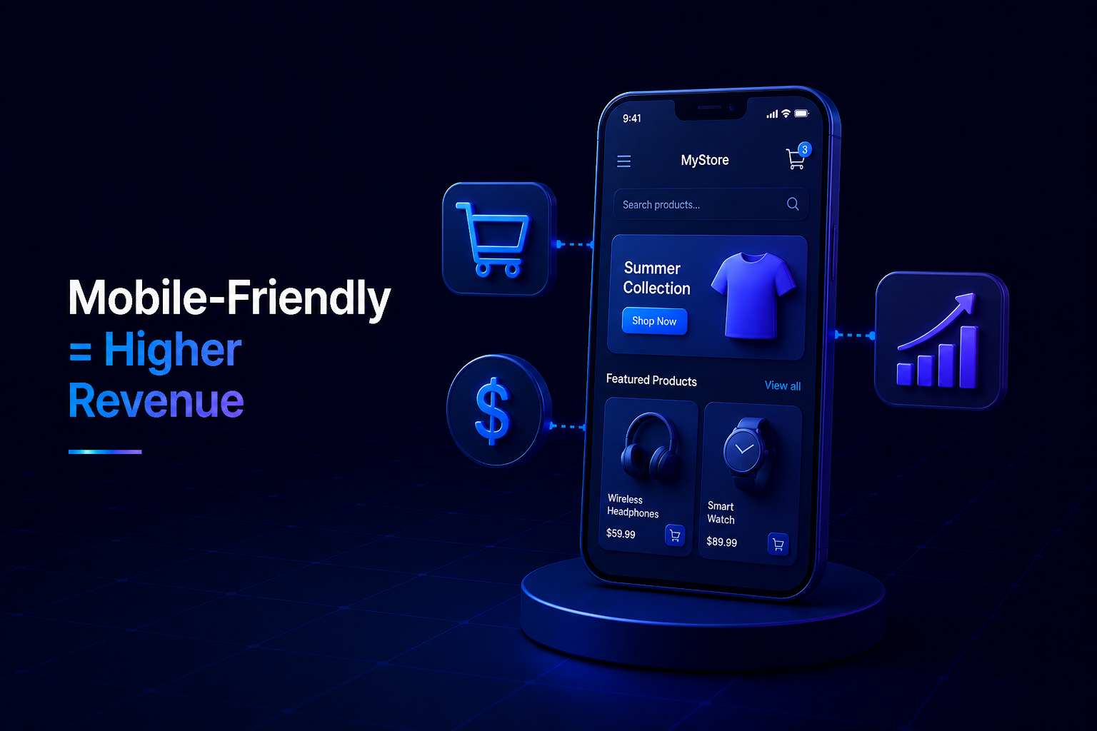
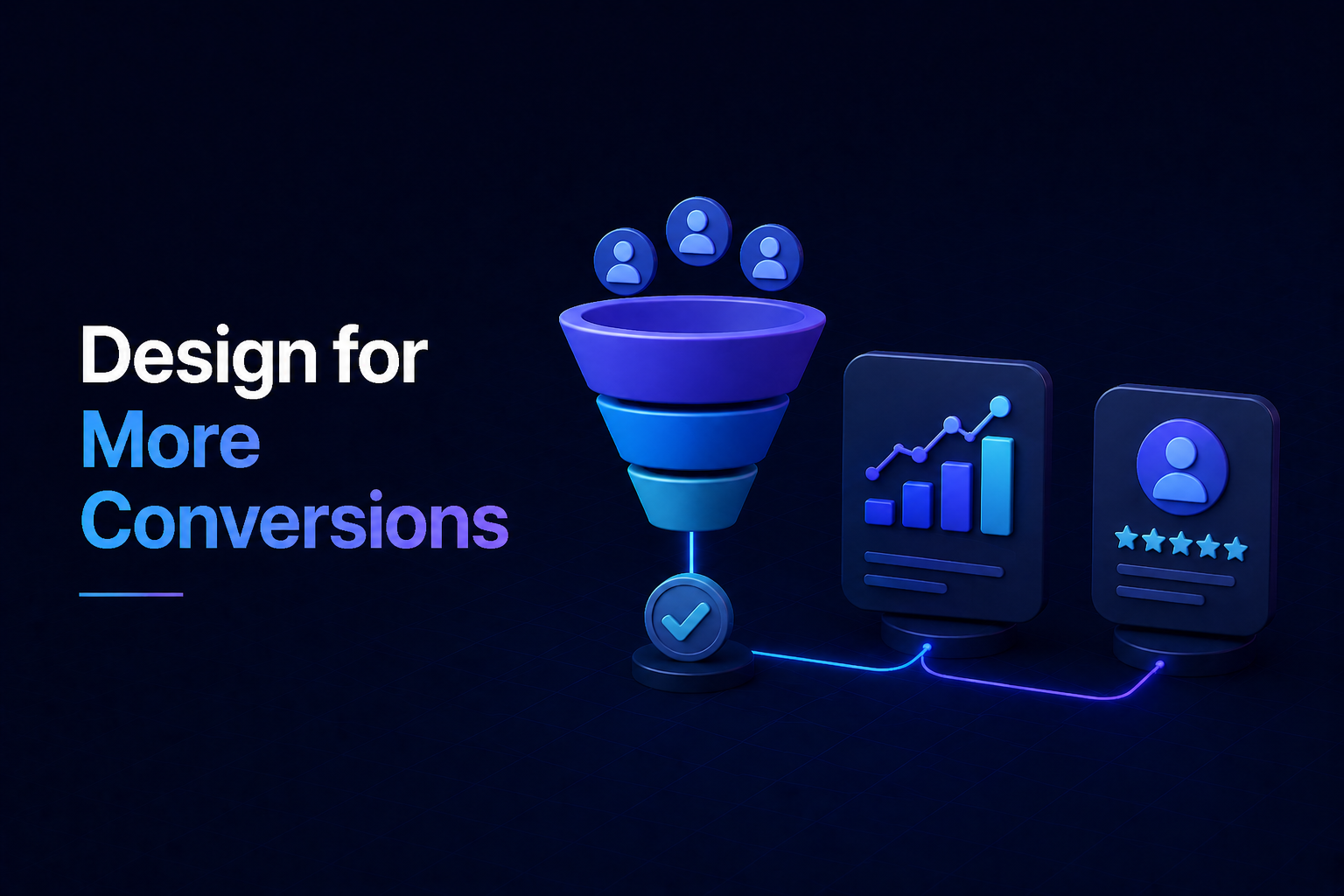
Driving Higher Conversion Rates
A great user experience and improved search visibility naturally lead to a powerful outcome: more conversions. Whether your goal is to generate leads, sell products, or simply gather sign-ups, a responsive site makes it easier for visitors to complete desired actions without friction.
From Browsers to Buyers
When users can easily navigate your site, read your content, and fill out forms on any device, they are far more likely to convert into customers or clients. Frustration is a conversion killer, and responsive web design eliminates those barriers, paving the way for a healthier bottom line for your business.
Cost-Effective and Future-Proof Solution
Some businesses might consider separate mobile versions of their sites. However, this often leads to higher development costs, increased maintenance, and potential content inconsistencies. A single responsive web design solves these challenges efficiently and positions your business for future digital changes.
Streamlined Management and Adaptability
- You only need to manage one set of content and one design, saving time and development resources.
- It’s easier to update and maintain a single website, ensuring consistency and accuracy across all platforms.
- Your site is better prepared for new devices and screen sizes that emerge in the future, extending its lifespan.
Embracing responsive web design isn’t just a trend; it’s a fundamental necessity for any modern enterprise looking to thrive online. By prioritizing an exceptional user experience, improving your SEO, and boosting conversions, your business website transforms from a static presence into a dynamic engine for sustained growth. Invest in responsiveness, and watch your business flourish in the ever-evolving digital landscape.


No Comments