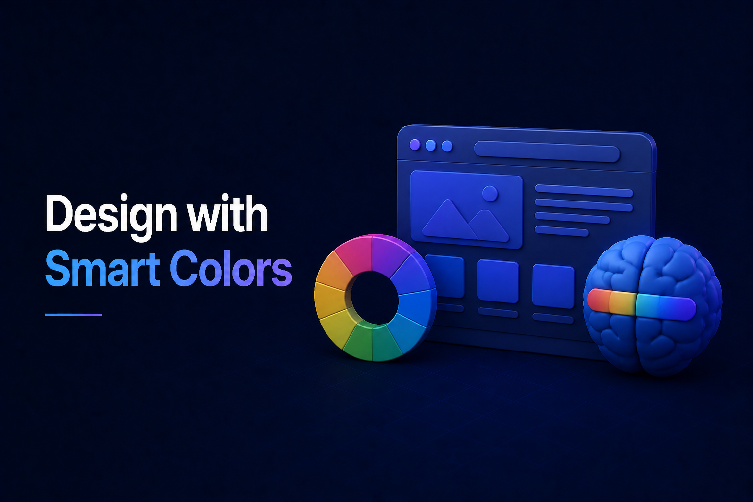
Colors do more than just make your website pretty; they evoke emotions, influence decisions, and build perceptions. In the realm of web design, understanding website color psychology is not just an art, but a strategic tool that can profoundly impact user experience and conversion rates. Let’s dive into how you can harness the power of color to create a more effective and engaging online presence.
Decoding Website Color Psychology
At its core, website color psychology explores how different colors affect human behavior and emotions in the context of web interfaces. Every shade and hue carries inherent associations, which users unconsciously perceive and respond to. For your web design to truly resonate, you need to align your color choices with your brand’s message and your target audience’s expectations.
Why Color Matters So Much for Web Design
- Emotional Connection: Colors directly tap into our feelings, creating a first impression that can be positive or negative.
- Brand Identity: A consistent color palette helps establish and reinforce your brand’s personality and recognition.
- User Guidance: Strategic use of color can direct users’ attention to important elements, like call-to-action buttons.
- Perceived Value: Colors can influence how users perceive the quality and trustworthiness of your offerings.
Exploring Key Colors and Their Impact
Different colors elicit distinct responses. Knowing these associations is crucial for an effective website color psychology strategy.
- Blue: Often associated with trust, stability, professionalism, and calmness. It’s a popular choice for corporate, finance, and tech websites.
- Green: Symbolizes nature, growth, health, prosperity, and tranquility. Ideal for environmental, health, and finance-related brands.
- Red: Evokes energy, passion, urgency, and excitement. Use sparingly for call-to-action buttons or to signify importance, as too much can be overwhelming.
- Yellow: Represents optimism, warmth, happiness, and attention. Great for accents but can be fatiguing in large amounts.
- Orange: Combines red’s energy with yellow’s happiness, conveying enthusiasm, creativity, and friendliness. Often used for vibrant calls to action.
- Purple: Associated with luxury, creativity, wisdom, and spirituality. Favored by high-end brands, beauty products, or creative agencies.
- Black: Conveys sophistication, power, elegance, and modernity. Often used in luxury brands or for a minimalist, high-contrast look.
- White: Represents purity, simplicity, cleanliness, and minimalism. Essential for creating whitespace and a clean, uncluttered feel in web design.
- Gray: A neutral color signifying balance, formality, and professionalism. Excellent for backgrounds, typography, and complementing more vibrant hues.
Strategically Applying Color to Your Website
Choosing individual colors is one thing; combining them effectively is another. Your overall palette tells a story.
Crafting Your Website’s Color Palette
When selecting your colors, consider these factors for your web design:
- Target Audience: Different demographics react differently to colors. Research who you’re trying to reach.
- Brand Identity: Ensure your chosen colors align with your brand’s personality and values. Are you playful, serious, innovative, or traditional?
- Color Balance: Typically, a good palette includes a dominant color, 1-2 accent colors, and neutral colors (like whites, grays, or blacks) for backgrounds and text.
- Accessibility: Always ensure sufficient contrast between text and background colors to meet accessibility standards and ensure readability for all users.
Practical Tips for Effective Web Design Color Choices
Making informed decisions about your website’s colors doesn’t have to be daunting.
Here are some actionable steps:
- Start with Your Brand: If you have an existing logo or brand guide, those colors are your foundation.
- Look at Competitors: See what successful sites in your niche are doing. Don’t copy, but understand common industry associations.
- Use Color Tools: Online palette generators (like Coolors, Adobe Color) can help you find harmonious combinations.
- Test, Test, Test: A/B test different color schemes for critical elements like call-to-action buttons to see what resonates most with your audience.
Mastering website color psychology is a powerful asset in creating impactful web design. By thoughtfully selecting and combining colors, you can evoke the right emotions, guide user behavior, and ultimately build a stronger, more memorable brand online. Remember, every color choice is an opportunity to communicate and connect with your audience on a deeper level.


No Comments